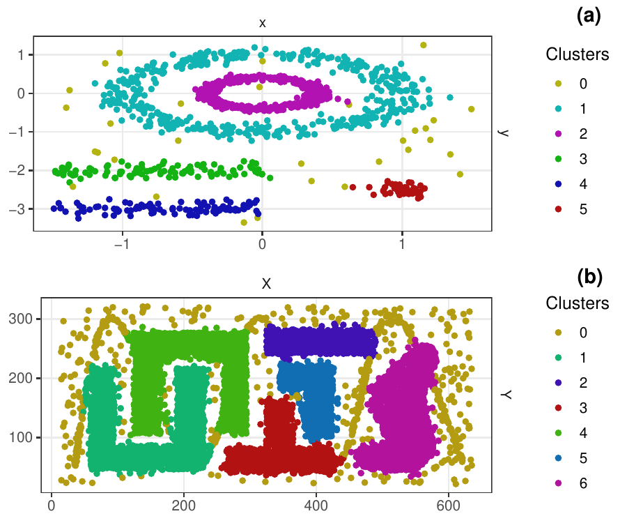
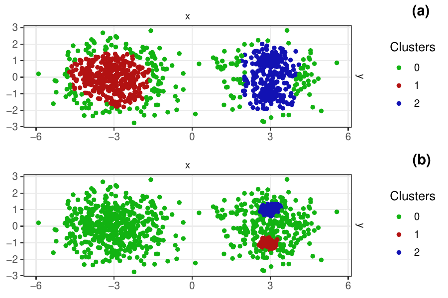
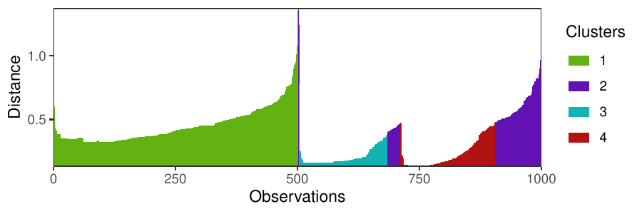
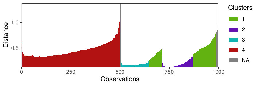
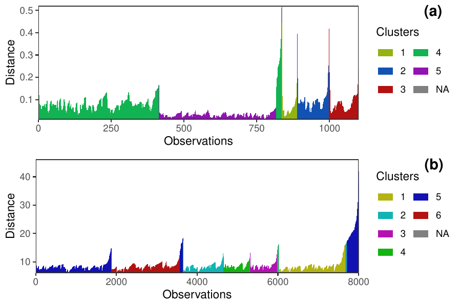
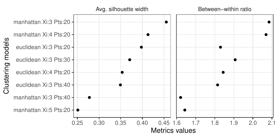
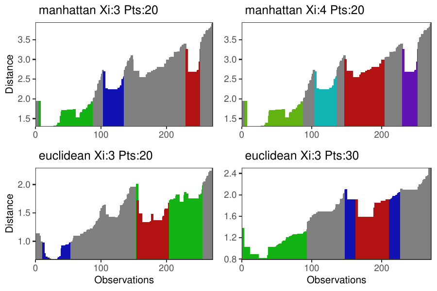
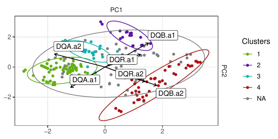
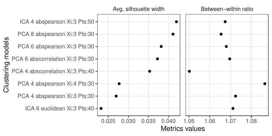
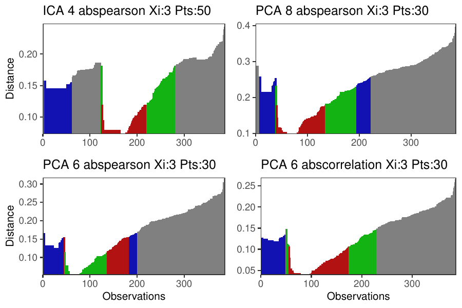
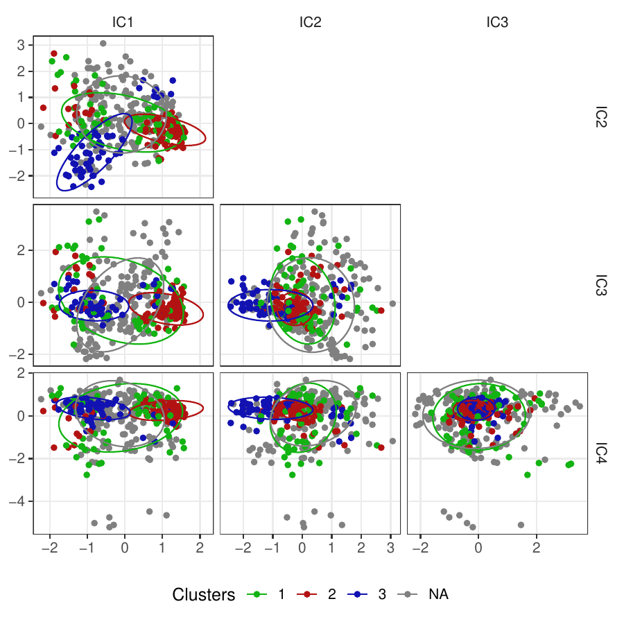
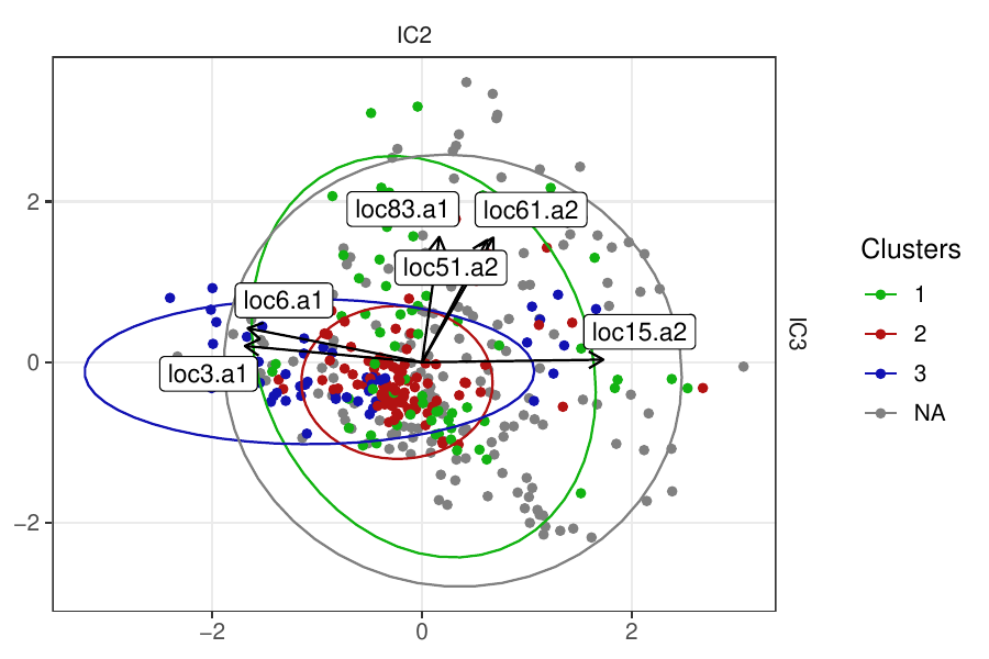
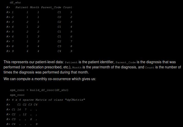
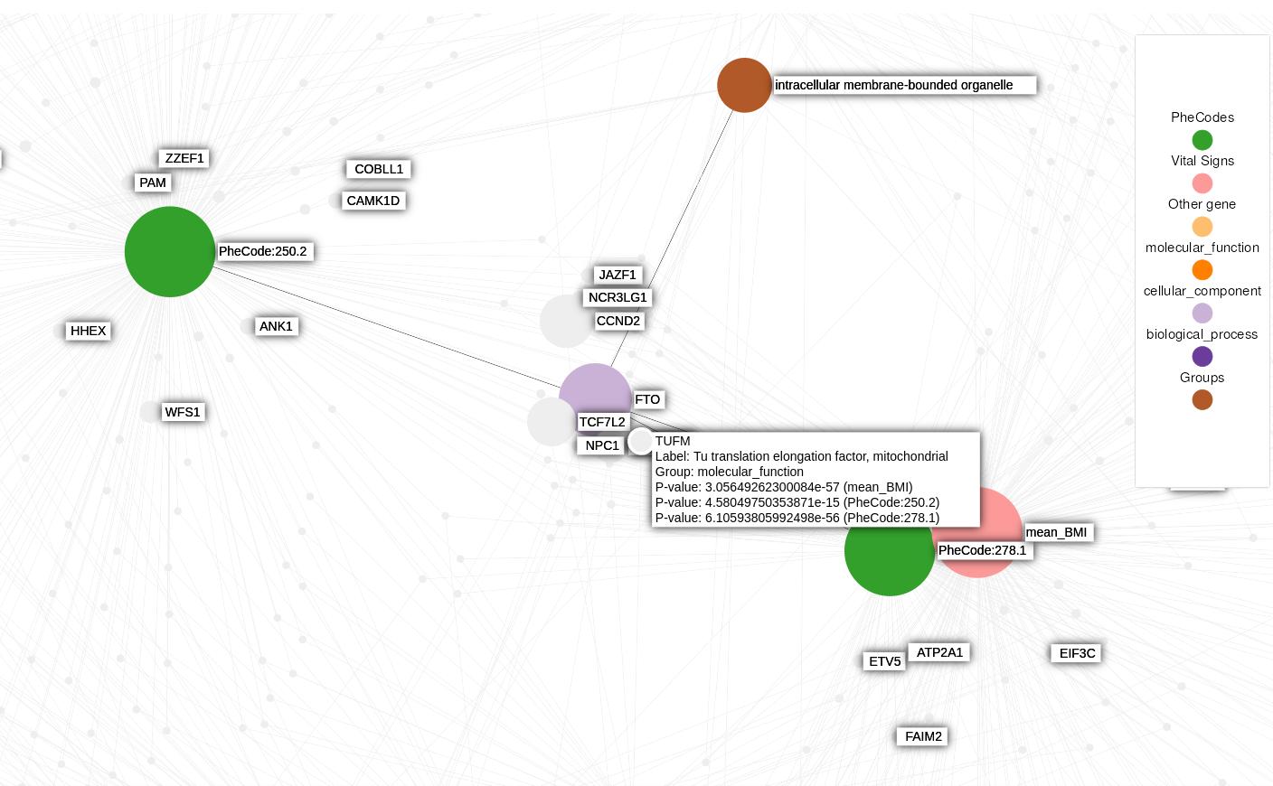
Density-based clustering methods are well adapted to the clustering of high-dimensional data and enable the discovery of core groups of various shapes despite large amounts of noise. This package provides a novel density-based cluster extraction method, OPTICS k-Xi, and a framework to compare k-Xi models using distance-based metrics to investigate datasets with unknown number of clusters. The vignette first introduces density-based algorithms with simulated datasets, then presents and evaluates the k-Xi cluster extraction method. Finally, the models comparison framework is described and experimented on 2 genetic datasets to identify groups and their discriminating features. The k-Xi algorithm is a novel OPTICS cluster extraction method that specifies directly the number of clusters and does not require fine-tuning of the steepness parameter as the OPTICS Xi method. Combined with a framework that compares models with varying parameters, the OPTICS k-Xi method can identify groups in noisy datasets with unknown number of clusters. Results on summarized genetic data of 1,200 patients are in Charlon T. (2019) doi:10.13097/archive-ouverte/unige:161795.
Provides efficient methods to compute co-occurrence matrices, pointwise mutual information (PMI) and singular value decomposition (SVD). In the biomedical and clinical settings, one challenge is the huge size of databases, e.g. when analyzing data of millions of patients over tens of years. To address this, this package provides functions to efficiently compute monthly co-occurrence matrices, which is the computational bottleneck of the analysis, by using the ‘RcppAlgos’ package and sparse matrices. Furthermore, the functions can be called on ‘SQL’ databases, enabling the computation of co-occurrence matrices of tens of gigabytes of data, representing millions of patients over tens of years. Partly based on Hong C. (2021) doi:10.1038/s41746-021-00519-z.
Knowledge graphs enable to efficiently visualize and gain insights into large-scale data analysis results, as p-values from multiple studies or embedding data matrices. The usual workflow is a user providing a data frame of association studies results and specifying target nodes, e.g. phenotypes, to visualize. The knowledge graph then shows all the features which are significantly associated with the phenotype, with the edges being proportional to the association scores. As the user adds several target nodes and grouping information about the nodes such as biological pathways, the construction of such graphs soon becomes complex. The ‘kgraph’ package aims to enable users to easily build such knowledge graphs, and provides two main features: first, to enable building a knowledge graph based on a data frame of concepts relationships, be it p-values or cosine similarities; second, to enable determining an appropriate cut-off on cosine similarities from a complete embedding matrix, to enable the building of a knowledge graph directly from an embedding matrix. The ‘kgraph’ package provides several display, layout and cut-off options, and has already proven useful to researchers to enable them to visualize large sets of p-value associations with various phenotypes, and to quickly be able to visualize embedding results. Two example datasets are provided to demonstrate these behaviors, and several live ‘shiny’ applications are hosted by the CELEHS laboratory and Parse Health, as the KESER Mental Health application https://keser-mental-health.parse-health.org/ based on Hong C. (2021) doi:10.1038/s41746-021-00519-z.
Create interactive time series visualizations. ’linevis’ includes an extensive API to manipulate time series after creation, and supports getting data out of the visualization. Based on the ’timevis’ package and the ‘vis.js’ Timeline ‘JavaScript’ library https://visjs.github.io/vis-timeline/docs/graph2d/.
Linkage disequilibrium visualizations of up to several hundreds of single nucleotide polymorphisms (SNPs), annotated with chromosomic positions and gene names. Two types of plots are available for small numbers of SNPs (<40) and for large numbers (tested up to 500). Both can be extended by combining other ggplots, e.g. association studies results, and functions enable to directly visualize the effect of SNP selection methods, as minor allele frequency filtering and TagSNP selection, with a second correlation heatmap. The SNPs correlations are computed on Genotype Data objects from the ‘GWASTools’ package using the ‘SNPRelate’ package, and the plots are customizable ‘ggplot2’ and ‘gtable’ objects and are annotated using the ‘biomaRt’ package. Usage is detailed in the vignette with example data and results from up to 500 SNPs of 1,200 scans are in Charlon T. (2019) doi:10.13097/archive-ouverte/unige:161795.
Sgraph enables to visualize graphs using the latest stable version of Sigma.js v2.4.0. Graphs are created using the igraph package.
This package uses ggplot-like grammar: a basic visualization is first created and then modified by adding/removing attributes with additional functions, using the pipe operator from the magrittr package.